Dear friends, we are gathered here today to say goodbye to a cherished loved one:

 That’s the cover of Defenders #38 on the front; Defenders #33 on the back—a shirt I wore proudly for over ten years. Even when it first started to wear out a couple years back, I continued to wear it as a nightshirt. But as you can see, the poor boy’s deteriorated beyond all hope now. I suppose I could still use it as a dust rag, but why make him suffer such indignity? Better the quick death of the wastebasket.
In addition to the classic comic covers it sports, both front and back, this shirt is memorable because it was among the first I ever made for myself back in 2002. There were over a dozen I made that late spring/early summer. I hadn’t anticipated making any more of them after that, but then ideas for new shirts just kept coming—in fact, I don’t think a year’s gone by since that I haven’t made at least one new T-shirt or sweat shirt. It wouldn’t surprise me if I had almost 100 of ‘em at this point. (This is just a guesstimate, of course, as I’m not about to back and try to count them all.) With the passing of my beloved Defenders shirt, it dawned on me that I might as well discuss my T-shirt fascination and share some pics while the shirts are still figuratively breathing.
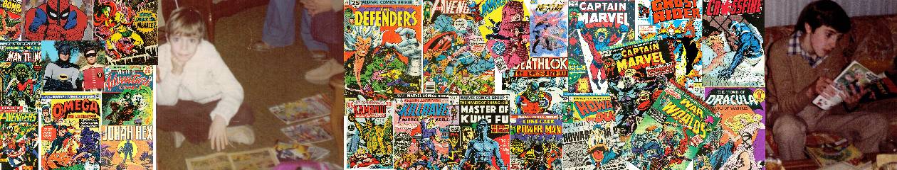
First, however, I imagine some more background is called for. I guess it all started with a Marvel house ad in 1976 that featured T-shirts with comic covers on ‘em—specifically Marvel Double Feature #8 and Captain Marvel #35. Here’s the ad where I likely first saw them, from Marvel Team-Up #48 (cover date August 1976):

Here’s a better view of the covers they used:


I didn’t buy either of these shirts, nor have I ever seen anyone wearing either of them anywhere. Which isn’t surprising when you think about it, ‘cause those are some odd choices of covers to put on T-shirts. Double Feature was a reprint book after all—why not put the cover of the original book on there? (And the title banner takes up a third of the image, to boot!) And Captain Marvel #35 is a nice cover, but hardly an ideal candidate for a T-shirt, as it shows Cap in a state of helplessness and does not depict much else in the way of action at all. Any of the Starlin covers from the preceding ten issues would have been a better choice. More broadly, why not go with a cover from one of your more popular titles like Spider-Man or Fantastic Four? It’s truly a mystery.
Still, a seed had been planted in my imagination. There were so many great, iconic comic book covers that would make great T-shirts. Maybe one day I’d get the opportunity, somehow, to make one for myself. That day arrived when I came across a set of iron-on paper in a craft store sometime circa 2000. When I saw it, I remembered those old comic-cover shirts and thought I could have a lot of fun making some of my own. I started out picking covers from some of my favorite old comics to use; then it kind of evolved into a mission of using favorite old comics of mine that had been largely forgotten (or ignored altogether) by the general public. (Which is why I made five different shirts featuring Omega the Unknown.) This was my own futile way of advocating for great comics that were not properly appreciated in their own time. It also did a pretty good job of advertising my own geek cred, as I was almost quite literally wearing it on my sleeve.
Now when you’re shopping for iron-on transfer paper, there are two types you can get: One type for light-colored shirts and another type for dark-colored shirts. All require an inkjet printer. The light-colored ones you print in reverse (mirror-style) and peel the paper off after ironing. With the dark ones, you print them out conventionally and literally iron them on to the shirt (in other words, the paper adheres to the shirt).
I would quickly learn that the dark-shirt paper worked a lot better than the light. That old Defenders shirt was actually made with light paper and was one of only two light jobs that really worked at all. The other was my classic Warlock shirt (featuring the cover to Strange Tales #78):

Now I think this effort was aided by the fact that the orange shirt matched Warlock’s natural hue. None of the other light-shirt iron-ons looked nearly as good as this one or the Defenders one. And the dark shirts all came out still better than these and with less fuss, too.
(Before I go any further, I feel compelled to point out that I only make these shirts for my own personal pleasure; I do not sell them, so please don’t ask. Besides, it’s an easy enough task that you should be able to make your own if you really want one.)
I think the best-looking effort of that first batch of dark-shirts was probably this one:

That’s the cover of Astonishing Tales #26, featuring Deathlok. I don’t know if the camera quite captures just how sharp this looks. Similar to the Warlock one, I think it’s the red banner on the cover matching the red color of the shirt so perfectly that makes it “pop” so much. Whenever I wear it out in public, it certainly captures the eye of many a passerby.
With time, I began to experiment some. Here’s a shirt featuring the iconic cover of Amazing Spider-Man #50:

. . . And for the back I used this full-page splash from the issue’s interior:

While it wasn’t intentional, I later realized I had unconsciously created a front-and-back, coming-and-going motif here. I then went for this effect more consciously with the following Cerebus shirt:


The sketches are by Dave Sim with inks by Barry Windsor Smith, from the front and back covers of Volume #5 of the Swords of Cerebus reprint collection.
The experimenting continued with my shirt featuring art from Amazing Spider-Man #33. I eschewed the cover for this shirt and went instead with that legendary interior sequence where Spidey lifts that giant wreck of machinery off his back. The trick, of course, was that this sequence was four pages long, so it would take some juggling to capture it on the front and back of just one shirt. I started by skipping the first page (page 2 of the original story) and picking up with the second (page 3). Then I took page 4 and split it in half; running the first half at the bottom of page 3 on the front. The second half got placed atop page 5 on the back. Here are the results:

 I did only one other shirt collage-style like this—it’s the front of my Master of Kung Fu shirt and it just might be my masterpiece:

Honestly, I think this front design was born out of my inability to choose between several awesome covers by Paul Gulacy (and one cool illustration by Mike Zeck). The back is a pin-up by Zeck from a later issue in the series. I dug the various koans Shang recites for the readers on this one:

At some point—and I’m not sure precisely when—I started making shirts for sheer kitsch factor. Here’s a sweatshirt that I call my “Valentine’s Day special,” featuring the cover of Just Married #78:


“Marriage is for Squares” still makes me want to giggle like a stupid kid whenever I see it.
Here are some other random favorites. Let’s start with one of those five Omega shirts I mentioned earlier:

A classic cover by Gil Kane. This is actually the back of the shirt—the cover of the first issue of the series is on the front. In hindsight, it probably would have worked better the other way around.

Anyone who knows me would know that a Howard the Duck T-shirt was inevitable. I made several, of course, but this one works best, featuring the cover of Howard the Duck #8, a natural choice for a T-shirt or poster if there ever was one.

This one was made because I simply could not resist making a shirt for myself that said “Giant-Size Man-Thing” on it. Seriously though, with several issues to choose from, I think this is the best cover of them all—that Frank Brunner art is just glorious to behold.

This is Amazing Adventures/War of the Worlds #28, featuring Killraven. Another example of a more obscure Bronze Age series that was close to my heart and I wanted to promote to the larger world. One of my fondest experiences with these shirts was the guy who saw me wearing this in the Walmart one day. His eyes lit up as he pointed at me and said, “Killraven! Oh man, I remember Killraven!”


This is my Miracleman (or Marvelman, if you prefer) shirt. I made this shirt because (A) I loved the comic series, of course, and (B) because I knew that due to the rights issues over this character being such a legal mess there would likely never be an “official” Miracleman shirt (or any official licensed products featuring the character). So the only way to get such a shirt would be to make one. The front features the costume logo and the “Kimota!” on back is from a tiny ad in the back of Warrior blown up and colored via photoshop

Nothing screams geek cred like the Legion of Super-Pets! Another favorite shirt of mine.


In case my love of Krypto the Super-Dog wasn’t clear, here’s another that features him front and back. Front is Adventure Comics #259, back is Superboy #101.


A theme shirt featuring the cover of Marvel Team-Up #74 (cover date Oct. 1978) on the front and Avengers #239 (cover date Jan. 1984) on the back. The theme, of course, is classic late-night TV shows in comics. Both issues were also pretty fun reads.


Yeah, okay, so this one was for comedic value. This cover of Young Romance #197 (cover date February 1974) featured lesbian innuendo that was actually kinda bold for the early 70s. Of course, the actual story had no homosexuality of any kind—Liz was just ever so slightly tomboyish and just waiting for the right guy to come into her life (which he did by story’s end, naturally).
I have more but I think this truly is the cream of the crop. At some point in the future I might do a post on my denim jacket—or as I call it, my “Technicolor dream coat.” It’s only slightly comics related, but it’s quite a sight.
3 thoughts on “Funeral for a Friend”