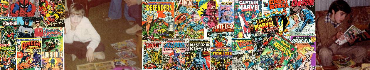
We lost another giant recently—Rich Buckler, who passed just one week ago. Comics readers of my specific age should be rocked by this one. When Herb Trimpe died a little more than two years ago, I recalled how omnipresent his work was at Marvel, the only comics company he ever worked for. Buckler, however, worked almost literally everywhere. So even if you were, say, a religious DC reader, you saw Buckler’s work. A lot.
Go no further than the banner at the top of this page. That’s Buckler’s handiwork on the cover of Defenders #38. (A cover so loved by yours truly that I made a T-shirt out of it. Additionally, I reviewed the issue in question less than a year ago.) That’s also his art on the cover of Astonishing Tales #26 (featuring Deathlok—and yet another inspiration for a homemade T-shirt).
Buckler’s first break with one of the “big two” was at DC with some “Rose and Thorn” backups in the pages of Lois Lane. From there he struck gold at Marvel, penciling the initial installments of Don McGregor’s “Panther’s Rage” series of Black Panther stories in the pages of Jungle Action—one of the greatest storylines of the Bronze Age.


Then he landed the FF assignment, where he would do some wonderful work for two years (1974-1976). Buckler also did a bunch of great covers for Marvel during this period.

Buckler’s personal masterpiece, however, was Deathlok, indisputably. At the time, the popular consciousness was consumed by this other cyborg from another medium—television’s Six-Million Dollar Man. A few ignorant voices thought Deathlok might be an attempt at imitation for the purposes of a quick cash grab, but all you have to do is look at the two characters to know this wasn’t the case. Steve Austin (as played by Lee Majors) was devilishly handsome while Deathlok was positively grotesque.


This is likely a big part of why Deathlok was/is so cool: He’s not just a cyborg, he’s a zombie cyborg. A souped-up, weaponized corpse, basically. And he looks it.
Speaking more personally, there’s also a rather powerful moment in just the third issue of the original series (Astonishing Tales #27) that has always stuck with me. Deathlok, overwhelmed by emotion, seeks out his wife and child, both of whom believe him to be long dead. Of course his wife doesn’t recognize him and thinks he’s a monster; and after this rejection he can’t even bring himself to look at his young son. This leads him to the heartbreaking decision to end his own life, at which point he discovers… he can’t.

This hit me on a rather primal level, possibly because, as an adoptee, I feared/harbored feelings of rejection like that from my own family. Funny how I can always find some kind of connection back to my adoption issues in so many comic-book stories. Honestly, it’s not like I’m looking all that hard, they just always seem to be there.
In any case, from there, Buckler (along with scripter David Anthony Kraft) pulled off one of the slickest moves in comics history. After creating a character called Demon Hunter for Martin Goodman’s short-lived Atlas Comics, the two effectively reclaimed custody of the character at Marvel, re-christening him as “Devil Slayer.” Yeah, the name is different (both the superhero name and the civilian name, as “Gideon Cross” becomes “Eric Simon Payne”), but the origin and powers are precisely the same. The costume is basically the same as well, only with a different (and far better, in my opinion) color scheme. I guess these small changes were just enough to avoid copyright infringement…? Or was Goodman simply not paying attention?


Note that the plane he’s boarding at the end of Demon Hunter #1 was actually bound for Jamaica, while the arriving plane in that issue of Spotlight was landing in New York from Jamaica. Were I a gambling man, I’d bet Buckler & Kraft produced a second issue of Demon Hunter for Atlas telling of his adventure in Jamaica, but it went unpublished.
Buckler then made the jump to DC, where he did some great work on Secret Society of Super-Villains and with Captain Comet, among many other titles (and again, a ton of covers). He also did the Superman vs. Shazam! treasury, as briefly covered by me back in the Pronto days.
In 1981, Buckler served as artist of the earliest issues of Roy Thomas’s All-Star Squadron. As a huge Golden Age geek, this run was a favorite of mine, even though it was rather short lived.

In late 1982/early ’83, Buckler briefly served as the editor for Red Circle comics—a relaunch of Archie Comics classic superheroes. Again, his tenure as editor, writer, and artist didn’t last long (just a couple of months at most, it would appear; though he continued to take art assignments from the company for some time afterward), but was still quite memorable. In fact, they were among my favorite comics that were being published at that time, as it was my first exposure to this whole new universe of superheroes.

One of the things I loved about this (brief) run was how “Marvel” it felt (which I loved, of course, being a huge Marvel zombie). Take, for example, the subplot of the Shield inadvertently killing a guy robbing a jewelry store.

…Clearly an attempt at some Marvel-style realism. Of course, after Buckler left his post as writer/editor, the dead thief turned out to be not-so dead as it was all revealed to be a frame-up by some supervillain—not what Buckler had originally intended as writer, I’m sure.
I also liked the way Buckler refused to figuratively hold readers’ hands, just throwing the characters out there in the main stories without much background (though we would get some of their origins in the back of the magazine, after the main tale). This was likewise similar to Marvel, where they expected readers to keep up with the continuity on their own.
To wit: By the second issue of Mighty Crusaders, Buckler re-introduced a whole ‘nother batch of classic Archie heroes for readers to digest, as shown on the front & back covers.


Again, I was superhero crazy, so this thrilled me. A comic book story could never have too many superheroes for me back then.
At this point I feel compelled (as I don’t like to indulge in whitewashing) to bring up the swiping issue. Now a lot of artists would swipe back in those days, and Buckler had a reputation for it. Personally, I never saw that much of it in Buckler’s work, but it was during this period that he did some rather blatant swiping.
In Mighty Crusaders #1, in one of those aforementioned back-up origin sequences, we get origins for the original Shield, the Comet, the Web, Black Hood, Jaguar, the Fly, and Lancelot Strong (aka the new Shield). In the Fly and Strong sequences, we get artwork that would appear to be lifted directly from the original comics drawn by Jack Kirby more than twenty years earlier, but they’re both signed “R. Buckler ’82.”
As was their wont in those days, The Comics Journal seized on this like a rabid pit bull. In a review by Ted White published in TCJ #83, they even showed the original artwork side-by-side with the new.

For reasons that are rather unfathomable, Buckler decided to sue the Journal for the article. Which was madness, of course, because we can plainly see he did swipe from Kirby—almost line for line. Thankfully, Buckler would come to his senses a short time later and drop the suit.
The tragedy here is that Buckler was a very talented artist and really didn’t need to swipe. Or even if you felt the need to do so in this instance (for whatever reason), just credit Kirby. Or leave no credit at all—Archie owned all the rights to the original story, so they could certainly reprint it or re-purpose it any way they pleased.
As to the rest of his career, I never noticed much (if any) direct swipes in Buckler’s other work. Were there times he drew like Kirby? Sure; particularly on his initial FF run (Marvel basically encouraged everyone to draw like Kirby in those days). There were also times he appeared to ape Neal Adams. His best work seemed to draw inspiration from both at once.
Buckler continued to work many years after the Red Circle gig, but his last really-high-profile job was in 1985 when he penciled Peter David’s “Death of Jean DeWolff” storyline in Peter Parker, the Spectacular Spider-Man. Again, I loved his work here.


These are just highlights—as I said at the beginning, Buckler’s work was everywhere in the Bronze Age, and any comics reader that came of age during this time was touched by that work.
R.I.P., Rich Buckler.
One thought on “Rich Buckler 1949-2017”